Sero

CONCEPT
ROLE
Product & UX Designer (self-directed)
TIMELINE
July–August 2026, ongoing
TOOLS
Figma (structure, systems, hi-fi, prototyping), Figma Make (exploration within decisions already made)
STATUS
IA, flows, wireframes, and design system shipped. Interactive hi-fi screens in progress. Case study and Framer build ongoing.
CONCEPT OVERVIEW
Sero is a B2B operations platform for commercial galleries: inventory, sales pipeline, and role-based workflow, designed for teams currently using Google Sheets, email, and tools built for museums or auction houses rather than a working gallery floor. This case study documents work in progress: research, information architecture, and a component-based design system are complete. User flows, hi-fi screens, and an interactive prototype are still being built.
I founded and ran a gallery in New York, managed the full studio pipeline for artist Mark Kostabi, and handled international art logistics. I’m not coming at this as someone who researched the problem from the outside. I’ve lived it firsthand.
That’s the thesis of the whole project. The decisions that follow aren’t generic SaaS patterns adapted to the art world. They come from seeing firsthand how galleries actually operate and where things fall apart.
DOCUMENTED, PRACTITIONER SURVEY, JULY 2026
Clear evidence it was designed by someone who understands gallery operations.
— cited independently, in near-identical language, by two of four respondents in a short practitioner pulse, when asked what would make them actually trust a new platform enough to migrate real data into it.
That line is why the decisions below aren’t generic SaaS patterns wearing an art-world skin. They’re specific to how galleries actually break.
PHASE 01 OF 04
01
Research: four conversations, two real findings
I ran a short practitioner pulse. Four people actually doing this work: two gallery director/owners, a head registrar, an art handler/registrar. Small and self-selected; I’m treating it as a check against earlier affinity-map research, not proof on its own.


DOCUMENTED, PRACTITIONER SURVEY, JULY 2026
Every respondent, independently and unprompted, named the same two failure modes: updating the same information in multiple places, and not knowing the current status or location of a work.
— PRACTITIONER SURVEY, JULY 2026
That’s not a statistic. It’s the same complaint replicating across a director, a registrar, and a handler, three different vantage points on the same kind of organization.
What the research surfaced
Editions had to become a real object, not a text field. The solo-operator respondent flagged that inventory tools are built around unique paintings and handle prints/editions badly. Usually a workaround bolted onto a “unique artwork” schema. For a print gallery, that’s not an edge case; it’s the business. Sero models an edition as a first-class parent object: a rollup of sold/available/on-loan/reserved across the run, and every individual impression carrying its own independent status and location.
Registrar and Sales Associate needed different homescreens, not just different permissions. The two non-director respondents had noticeably different pain than the two directors: operational plumbing (missing integrations, too many fields, deadlines buried in email) versus strategic pain (fragmentation, lost leads). Same role model, not a new archetype, but different enough content that a shared homescreen under-served both of them.

Registrar homescreen: operational tasks, deadlines, item-level detail

Sales Associate homescreen: pipeline, leads, client-facing status
PHASE 02 OF 04
02
A real pivot, kept in rather than cleaned up
The first flow draft anchored on exhibition planning: opening a show, install/deinstall, post-show settlement. I killed it.
DOCUMENTED, DECISION LOG, AUG 14, 2026
More realistic to gallery operations for commercial galleries.
— my own stated rationale for re-anchoring the entire user flow on the sales-and-inventory lifecycle instead.
The sales lifecycle, Offer through Approval Gate through Settlement, is what a commercial gallery runs continuously, not just during a show. Higher frequency, higher stakes, and it’s the flow every hi-fi screen in this project now hangs off. For a Solo Operator, that same Approval Gate collapses into a single self-check the owner does alone.
Where I caught myself
The first version of the flow diagram showed the app asking “org type?” every time a new work item entered the system, which reads as if the product asks per-transaction. It doesn’t, and shouldn’t: org type (Multi-Site Institution vs. Solo Operator Curator) is an account-level fact, decided once at onboarding, not re-litigated per artwork. I caught this myself while building the onboarding wireframe, one deliverable later than I’d have liked. A diagram I’d already called “approved” was quietly wrong in a way a careful reviewer would have caught before I did. Fixed at the source (onboarding decides it once) rather than patched over in the diagram that was already wrong.
PHASE 03 OF 04
03
A brand system tested against a real problem, not just applied to screens
Sero’s identity, Space Grotesk for headings, Inter for UI and body, a five-color palette (Ink Black, Canvas White, Sage Gray, Soft Coral, Cadet Blue), was built early. The real test of a design system isn’t the style guide; it’s whether it holds up when a screen needs something the palette didn’t plan for.

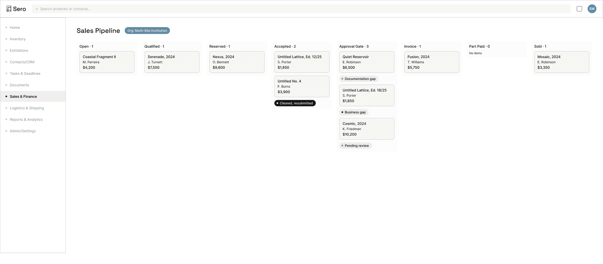
That happened building the Sales Pipeline board. The kanban cards need four distinct failure states legible at a glance: a documentation gap, a business gap, a stalled review, a cleared resubmission. The obvious move (the one the lower-fidelity wireframe actually made) is semantic red/orange/teal, because severity “should” be red and green in most systems.
WHAT THE WIREFRAME DID
Introduced three new colors outside the palette: a true red, orange, and teal, flagged at the time as a deliberate, temporary departure from grayscale.
WHAT HI-FI ACTUALLY SHIPPED
All four states told apart using the existing five tokens: Soft Coral for the most urgent state, a neutral Sage Gray tint for the lesser one, Cadet Blue for "still in progress," and the same solid-Ink-Black terminal treatment already used for a Sold badge, reused for "resolved." Four scannable severities, zero new hues, five weeks into the project.
That’s the actual content of “branding integrated with product,” not a palette applied to screens, but the discipline to solve a real usability problem inside a closed system instead of quietly growing it.
PHASE 04 OF 04
04
Interaction design: the one capability with no prior evidence, now demonstrated twice
This was the named, explicit gap in my portfolio going into this project. It needed to be clicked, not described.
BRANCH 01 OF 02
The organization-type branch
At onboarding, choosing Multi-Site Institution versus Solo Operator Curator is a permanent, account-level decision. In the live prototype, clicking either option navigates immediately to that archetype’s own next step: two structurally different screens, produced by the same step in the same flow, because of one earlier choice. Not two states shown side by side. An actual fork a reviewer clicks through themselves.
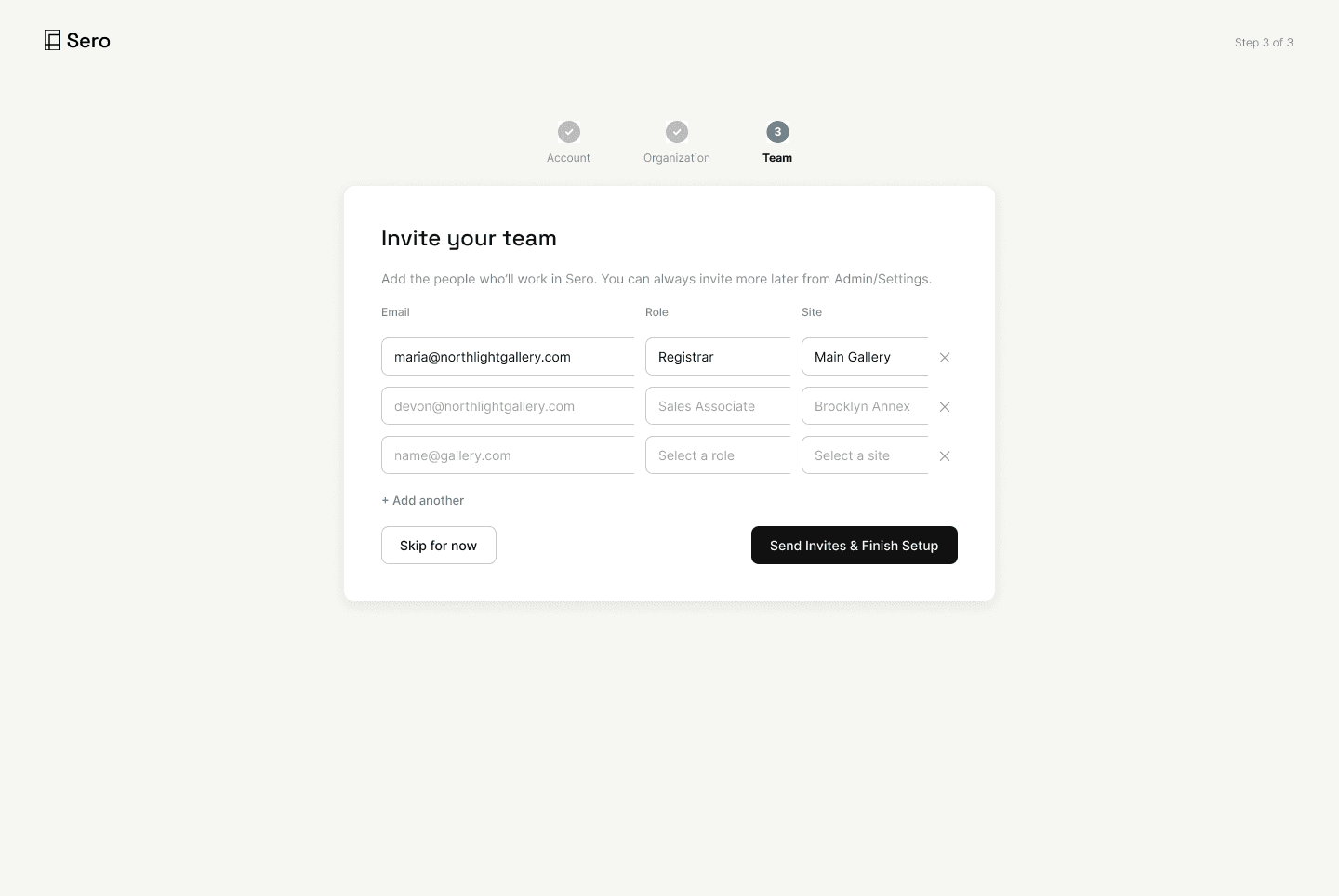
Multi-Site Institution: team invite step (Devon, Sales Associate)

Solo Operator Curator: the same step, collapsed to a single-user setup
BRANCH 02 OF 02
The unique-work / edition branch
In the Inventory grid, two cards that look almost identical route to genuinely different screens when clicked. A unique painting opens a standard detail page. A print opens the edition-impression variant, with a “view full edition” link to the parent edition object, which links back to that exact impression. Click through it and you’re looking at the same real object, impression 3 of 25, from two zoom levels, both live, both correct, both reachable from each other.

Unique work: standard artwork detail page

Print: edition-impression variant, impression 3 of 25, linking to the parent edition
OUTCOMES
What’s built, and what isn’t, kept honest rather than smoothed over
BUILT
Information architecture (nine modules, four roles, access levels). Two user flows with role-based branching. Low-fi wireframes, reviewed before any pixel polish. A working component library: badges, cards, modals, a data-dense field pattern, a kanban card system. Interactive hi-fi screens in progress across onboarding, login, role-specific homescreens, inventory, an artwork detail pair, edition detail, the add-artwork flow, and the sales pipeline board, with click-through connections between them.
OPEN
Reports & Analytics doesn’t exist yet. Its sidebar entry and a deep-link the wireframe promised both stay honest dead ends for now. The Solo Operator branch forks correctly once, at onboarding, but nothing past login proves it out; there’s no Solo Operator homescreen or pipeline, so that archetype’s story stops early. Every screen still assumes Owner-level access regardless of which role’s homescreen you started from. Role-based permissions shape content but not yet navigation.
WHAT I'D DO DIFFERENTLY
Build out the proof point before polishing everything else
Sequence the archetype branch further before going deep on hi-fi polish. The Multi-Site/Solo Operator fork is the single clearest interaction-design proof point in this whole project, and it currently only survives one screen past the moment it’s chosen. I went deep on data density and brand-system discipline for Multi-Site Institution: Sales Pipeline, Edition Detail, the two homescreens, before confirming the other half of the same decision actually goes anywhere. Next project, the branch that’s meant to prove the interaction design gets built out before the branch that’s easiest to make look finished.