SensAI

ENGAGEMENT
Engagement overview
CONTRACT
Deel · UI/UX Designer · Pay As You Go
PROJECTS
3 projects · ~12hrs each · July–October 2025
In June 2025, SensAI founder Johnny Chin reached out for a one-week UX evaluation of his AI fitness coaching app. The brief was deliberately focused: UX over UI, actionable insights, visual with annotations. That engagement led directly to a formal contract, signed through Deel, and two subsequent project-based engagements with the full founding team.
Each project was scoped to approximately 12 hours. Each addressed a different layer of the same core problem: users weren’t getting enough value fast enough to stick around.
DOCUMENTED — IMESSAGE THREAD, JUNE 2025
The UI is less important to us at this stage. The UX is very important to us right now. We're looking for actionable insights on how to make the product more simple to use.
— JOHNNY CHIN, IMESSAGE BRIEF, JUNE 2025
PROJECT 01 OF 03
01
UX audit — AI transparency, onboarding friction, feature discoverability
July 2025 · Paid audit · flat fee · Delivered as annotated visual deck
Before a formal contract existed, Johnny commissioned a one-week embedded audit. I used SensAI as an actual user: following the AI-generated workout plan, logging sessions in real time, requesting adjustments through the chat interface. My own experience was the primary instrument. Three findings emerged, each pointing to the same underlying problem: the product’s intelligence was real, but invisible.

FINDING 01 OF 03
The AI is present but passive, and the product never explains the difference
SensAI’s onboarding promises “Smarter workouts. Personalized coaching.” The HealthKit connection screen goes further, listing Recovery Status and Progress Tracking as benefits of sharing health data. The framing implies a system that watches, adapts, and responds proactively.
Midway through my first workout, I asked the AI whether it could adjust my plan based on how I was feeling. Its response made the gap explicit.
DOCUMENTED — IN-APP CHAT, DAY 1
I don't have direct access to real-time health data or automatic monitoring, so I can't adjust your plan on my own without your input. Regular feedback from you is the best way to keep your plan responsive and effective.
IN-APP CHAT

AI chat showing verbatim “I don’t have direct access”
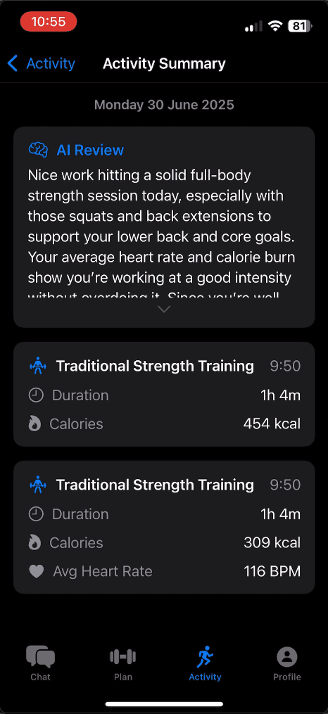
Activity Summary — AI Review buried
The coaching intelligence is real. It’s reactive, not proactive. That’s a defensible product decision. The failure is that it’s never communicated. When the gap surfaces late, in a chat conversation after a workout has already started, it lands as a broken promise rather than an honest capability statement.
FINDING 02 OF 03
Onboarding collects preferences, but doesn’t feel like a conversation
The onboarding flow is technically competent: clean layout, fast, good welcome microcopy. But the AI is absent from it. There’s no signal that the selections you’re making are being processed by something intelligent. You configure. You submit. A plan appears. Three specific problems compound this:

Meet SensAI welcome screen
Welcome screen
STATUS: STRONG
Clear brand promise, clean CTA, lightweight tone (“Takes under a minute. You can skip anything.”)

Preference setup screen
Preference setup
STATUS: MISSING
No AI signal — looks and feels like a form. Nothing acknowledges that the selections are shaping a personalized plan.

Apple Health permission sheet
HealthKit prompt
STATUS: PROBLEM
Overpromises AI capability before trust is established. Appears before the user has seen how the app works.
OBSERVATION
The HealthKit screen lists "Recovery Status: Personalized training intensity based on your sleep and recovery." The AI later says it can't adjust plans automatically. The permission screen overpromises; the AI underdelivers — with nothing bridging the gap.
EMBEDDED USER RESEARCH, WEEK OF JUNE 30, 2025
FINDING 03 OF 03
The product’s best adaptive features are hidden behind gestures users aren’t told to try
SensAI has a mid-workout exercise swap feature that’s contextually smart — a modal with pre-filled quick-select reasons (“This station is busy,” “Avoiding injury”), fast to use, good logic. Once found, it works well. The problem is how you find it.
Default state: no swap affordance visible
The exercise list shows name, muscle group, and a chevron. After expansion, only a delete button is visible. Nothing signals a swap is possible.
After interaction: swap appears
A blue circular-arrow swap button appears alongside the delete button, but only in certain expanded states. Nothing on screen signals it’s there.
No drag-and-drop reordering
No drag handle, no sortable affordance on the exercise list. Users who want to adjust sequence mid-session have no affordance to do so.

1. Exercise list, no drag handles

2. Expanded row, delete only

3. Delete and swap revealed

4. Swap modal, empty state
WORKING WITH THE TEAM — PROJECT 01
What changed after delivery, and why
DOCUMENTED — IMESSAGE THREAD, OCTOBER 2025
Johnny Chin: At a blush I thought that a lot of the advice was either strictly opinion (the guidance to use a professional tone rather than personal tone) or overly generic. Once you get a chance to spend some time with the onboarding, feel free to revise your thoughts and put a call on the books for us to discuss. Stephen Caudill: The figma is still in flux, so I don't think it makes sense to fork it at this point. Please do feel free to respond with copy changes or w/e before then.
— JOHNNY CHIN & STEPHEN CAUDILL
OUTCOMES — PROJECT 01
What shipped, what didn’t, what I can’t claim
SHIPPED · ATTRIBUTED
Microcopy revisions across onboarding flow. AI coaching persona standardized to first-person voice (“I”) for consistent assistant identity, approved in the Sep 30 all-team walkthrough and confirmed implemented by the engineering lead in writing.
SHIPPED · UNCLEAR
Fully redesigned onboarding layout, progress bar replacing dot indicators, accordion experience level selection, proficiency-based goal defaults, improved dark mode contrast. All shipped in Internal Build 185 alongside the attributed changes. Attribution to this audit not established.
NOT TRACKED
Impact on activation rate or first workout completion. No post-launch performance data was shared within the scope of this engagement.
DOCUMENTED — IMESSAGE THREAD, OCTOBER 2025
Hey Jorge — a quick video preview of the onboarding changes. I incorporated a number of your suggested microcopy changes here.
— STEPHEN CAUDILL
PROJECT 02 OF 03
02
Onboarding funnel analysis: why users weren’t reaching their first workout
September 2025 · Deel contract · ~12hrs
128
users in sample
SensAI internal analytics, included in client deliverable
23.4%
reached first workout completion
SensAI internal analytics, included in client deliverable
4.1%
retained by week 1
SensAI internal analytics, included in client deliverable
The initial audit identified onboarding friction as a problem. The second engagement went deeper — analyzing the specific drop-off points between first open and first workout completion, benchmarking against four direct competitors, and identifying quick wins for each stage of the flow.
The central finding: the first workout presented to new users was 35–60 minutes long and intimidating. The recommendation was a short intro workout (under 10 minutes) positioned before full plan creation, framed as a gift rather than a gate, designed to give users a quick success before the full commitment of a structured plan.
I delivered a written summary to Johnny on September 24 and walked the full team through the deck on September 30.
DOCUMENTED — EMAIL TO JOHNNY CHIN, SEP 24 2025
I'm also recommending a short intro workout of under ten minutes before full plan creation. This gives users a quick success and creates momentum before they see the more detailed setup.
— JORGE TORRENS, PROJECT 02 DELIVERY EMAIL
PROJECT 03 OF 03
03
Profile tab redesign: from settings page to motivational hub
October 2025 · Deel contract · ~12hrs
DOCUMENTED — EMAIL FROM MATT VOSKA, OCT 8 2025
For the first project: We'd like you to take a stab at the profile tab. Right now it is basically a settings page, but we want to imagine how we can make this page about the user's goals and achievements, but keeping in mind the data that we have today.
— Matt Voska
Three directions explored

OPTION A
Progress Dashboard
Circular progress rings (weekly workouts, consistency, minutes trained), horizontal scroll achievements, monthly momentum chart. High visual impact, requires surfacing existing workout completion data.

OPTION B
Coach View
Friendly first-person microcopy ("You're getting stronger each week!"), dynamic progress bar, gradient background tied to consistency. Emotional resonance over data density.

OPTION C
Minimal Stats & Achievements
Card-based layout, Stats → Achievements → Settings hierarchy, tap-to-expand detail views, light/dark mode compatible. Lowest implementation lift, most scalable.
NOT TRACKED
Strategic recommendation: Merge the Activity tab into Profile. When users see their data contextualized as personal progress rather than abstract stats, it reinforces intrinsic motivation. One destination instead of two. No follow-up documentation received after delivery. Whether any direction was selected or implemented is unknown.
WHAT I'D DO DIFFERENTLY
Get constraints on the table at kickoff
The most useful thing I learned across these three engagements wasn’t in any of the findings. It was in a single exchange after Project 1 delivery, when I proposed a hi-fi sprint and Stephen told me the Figma file was in flux and the design team was already handling the visual layer.
None of that was in the kickoff brief. I didn’t ask. A one-page intake document before each project, covering active roadmap commitments, who else is touching the same surface, and what’s already in motion, would have changed how I scoped and sequenced every deliverable. A recommendation that can be implemented this sprint is more valuable than a better recommendation that can’t.
On my next engagement, that document goes out before the first call.