Journey

SELF-DIRECTED CONCEPT · 6 WEEKS · 2025
CONCEPT
TYPE
Self-directed concept · Not validated with users
TIMELINE
6 weeks · 2025
ROLE & TOOLS
UX/UI Designer · Figma, Figjam
FOCUS AREAS
Visual design, Interaction design, Flow mapping, Design systems
CONCEPT OVERVIEW
Journey is a self-initiated concept project, not a client engagement, not validated with users. The goal was to work through a complete mobile design process: problem framing, visual system, and interaction flows.
The hypothesis: most travel booking apps optimize for solo users and treat group coordination as an afterthought. This concept explores what a mobile-first booking experience might look like if group travel were a first-class use case from the first screen, surfaced through a group-mode toggle that adds group-specific inputs without disrupting the solo booking flow.
FLOWS
01. Onboarding
Progressive onboarding
Value shown before account creation is required.

Establishes brand promise before asking anything

Lightweight preference collection

Intent-based personalization

Personalized feed before sign-up gate
02. Discovery to booking
Discovery to booking
Group mode surfaces without disrupting the solo flow.

Trip detail: full context before commitment

Date selection: calendar, then group or solo decision

Group mode off: default solo state

Group mode on: participant invite and role assignment revealed
03. Group mode toggle
Group mode toggle
One control unlocks coordination without cluttering the solo experience.
Toggle off: clean solo booking state
Toggle on: group-specific inputs appear inline
DESIGN SYSTEM
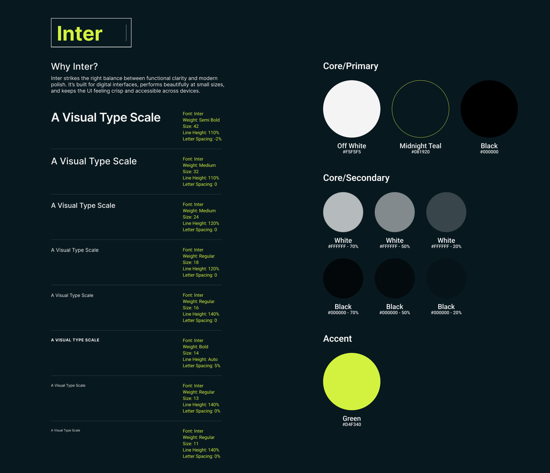
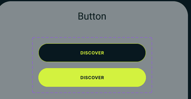
Journey needed its own identity. Inter carries all UI text, with a type scale running from 32px bold headers down to 11px tracked labels: confident at a glance, quiet in the details.



WHAT I'D DO DIFFERENTLY
Validate before designing
The group mode concept needed real group travel organizers before I built the flow, not after.
Replace competitive analysis with product teardowns
Actual teardowns of Airbnb and Booking.com’s group features would have been more honest and more useful than the feature comparison table I built.
Prototype the toggle interaction
The group mode toggle is the most interesting idea in this project and it exists only as static screens. The next version builds it as a working Framer component.